Description
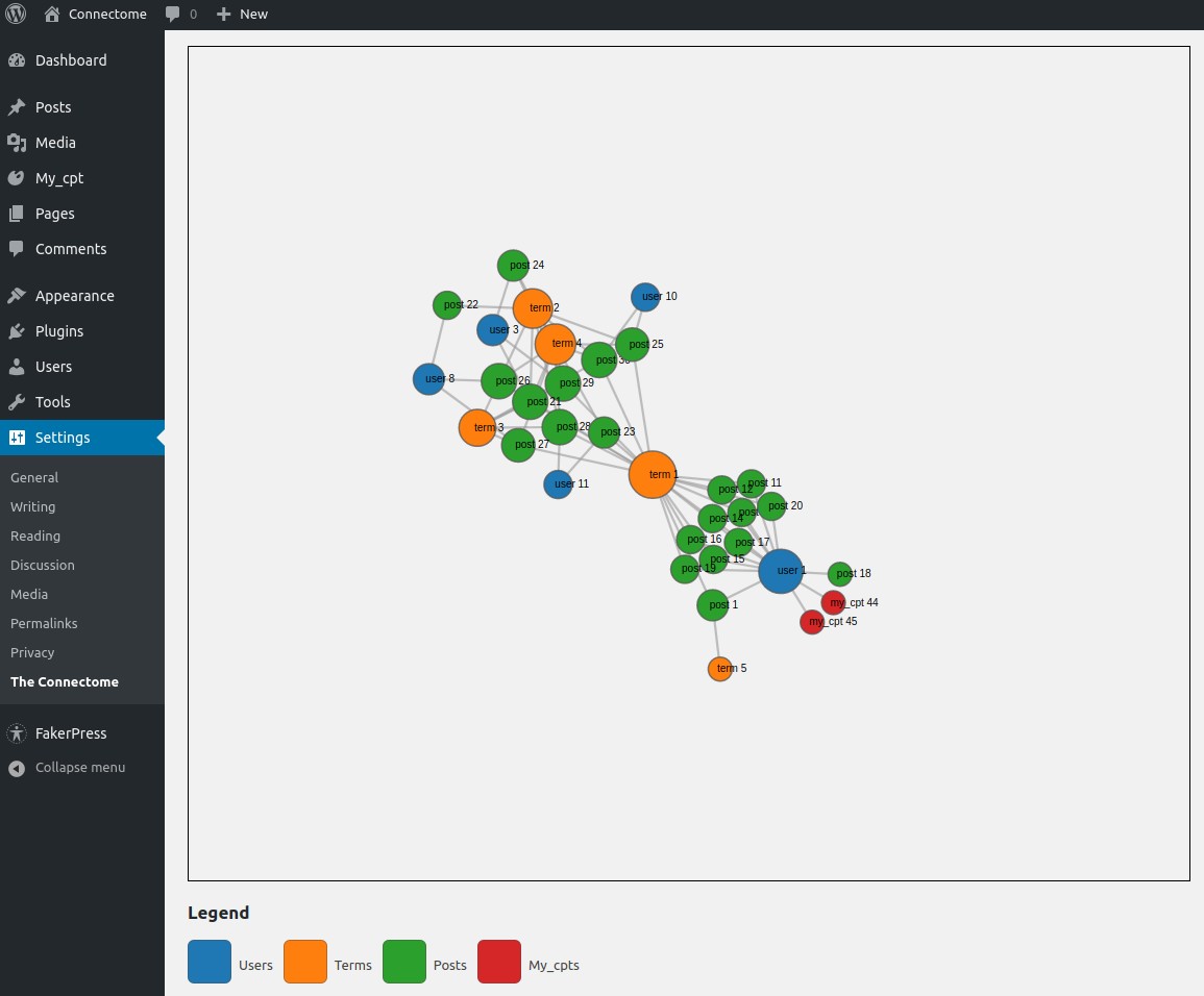
A WP site has posts, custom posts, users and taxonomy terms. The Connectome shows them all in a single interactive visualization as nodes and links of a graph. Also, we calculate some importance measure for these nodes and display it in the nodes sizes. The Connectome, then, should provide insight about the structure of your site and a different navigation, mostly interesting for the site admin but perhaps also, after some configurations, good to show to your visitors.
I think The Connectome could be useful to novice WP site creators because it will help you learn all the essential elements in your site and how they connect to each other.
The “importance measure” for the nodes is the degree centrality, that is, how many links touch the node.
This is the first release of my first plugin so I’m very exited and scared, but also quite open to suggestions, requests or criticism. I would be especially happy if more experienced developers inspected my code and gave me their opinions.
Live demo
It’s for a small site, but anyways
Road map
I have a long list of improvements to include in future releases, among them:
- Responsiveness and more flexible behavior for the visualization
- Search functionality to find nodes in the graph
- Having several graphs with different configurations to show in different parts of your site
- Tell the admin about problematic nodes like posts without featured image or excerpt text, taxonomy terms without description, etc.
- More interesting importance measures like the eigenvalue or the betweeness centralities, perhaps allowing the user to pick which one to use
- Multilingual support, right now it’s only English. Besides making it translation ready, this will also imply to make the plugin compatible with multilingual plugins like Polylang or WPML
If you think one of them is more urgent thant others, you can also tell me.
Performance
The good news is that, once the graph is created, it’s stored on the DB and and used until you save the options again in the options page. However, to build the graph we first include all the elements (but those manually disabled) and then connect them to calculate the centrality and evaluate which are the most important. Only then we reduce the elements, using the centrality as the metrics. That means a very big site (with many users, posts and terms) will require a lot of resources and time to create the graph, even if it ends up having few elements. Only when the elements are manually disabled they don’t participate on the graph creation. Probably if you have a very big site you would have a server with ample resources, but if you don’t, then probably is not a good idea to use The Connectome until the implementation changes.
Screenshots
Installation
- Upload
connectome.zipto the/wp-content/plugins/directory and extract it - Activate
The Connectomethrough the ‘Plugins’ menu in WordPress - Go to the plugin page (under settings in the admin) to build the graph
- Add the shortcode
[connectome-graph]in your pages or posts to see the widget - You can also insert
<?php echo apply_filters('the_content', '[connectome-graph]');?>in your PHP code
FAQ
- Can I decide which elements go in the graph?
-
Yes, you can decide in the settings page exactly which elements will be included. Next to each type of element there is a button to show a foldable panel where you can select each element individually. Right now is a bit cumbersome if you have many elements of some type. I’ll try to make this panel more functional in future releases.
- What if I want to show only certain amount for each type of element?
-
You can set a max amount of elements for each type. The first “most important” elements will be kept while the others discarded. The metrics by now is the degree centrality. More central nodes are considered more important.
Reviews
Contributors & Developers
“The Connectome” is open source software. The following people have contributed to this plugin.
ContributorsTranslate “The Connectome” into your language.
Interested in development?
Browse the code, check out the SVN repository, or subscribe to the development log by RSS.
Changelog
1.0.0
- First version


